
An ecommerce website built to help drivers find the right tyre for the road ahead.
Bridgestone is one of the world's leading tyre manufacturers and automotive services providers, with Bridgestone ANZ operating a national retail and commercial network across Australia and New Zealand. With a significant portion of their business driven through their ecommerce platform, the quality and clarity of the online experience directly affects tyre sales, service bookings, and customer confidence in the brand.
I was brought on as a User Experience Design contractor to help scale design output during a major rebrand and refresh of Bridgestone's existing AU/NZ ecommerce platform. Bridgestone's external design agency had established the template design direction and were building out the design system, but the volume of page-level design work required to build out the full platform exceeded what they could deliver within the project timeline. My role was to work alongside the design agency, using their template and contributing to their design system, to push out the page designs needed to bring the platform to life. Working remotely from Melbourne, with an initial week on-site in Adelaide to get up to speed, I reported directly to Bridgestone's in-house UX manager and stayed closely aligned with the design agency throughout.
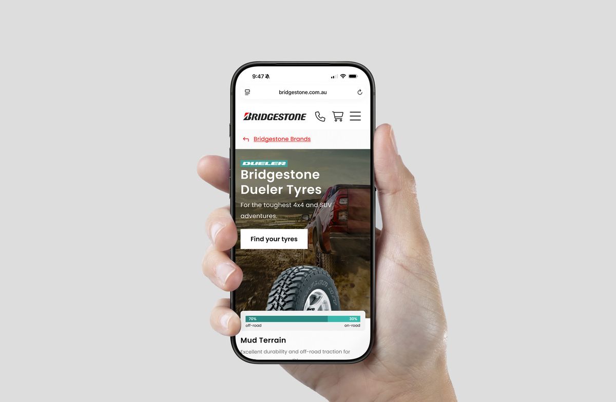
Bridgestone wanted to improve conversion rates across their existing ecommerce platform, particularly around tyre sales, as the system had become old and outdated compared to competitors. The path from landing on the site to adding a tyre to cart required too many clicks and drilldowns, users had to navigate through multiple layers of categories and filters before they even reached the point of being able to select and purchase a tyre. In a category where most users arrive with a relatively specific need, that friction was costly.
Alongside boosting conversion, the platform was due for a visual rebrand, a refresh of the look and feel to bring it in line with Bridgestone's current brand direction and elevate the overall experience for both desktop and mobile users.
The primary objectives of the rebrand and refresh were to:
My role was to work from the design agency's established template design and contribute to the design system they were building, applying both to design the full range of pages needed across the platform. The design agency handled the template direction and design system foundation, my job was to take that foundation and build out the platform's pages at the pace and volume the project required.
Over the course of the contract I delivered close to 200 page designs across mobile and desktop, spanning the full breadth of the platform, homepages, category pages, product pages, landing pages, and campaign templates, across both the Bridgestone AU and NZ experiences.
My contributions included:
The primary challenge of this engagement wasn't a single complex design problem, it was sustaining quality at volume. The brief required a large number of page designs delivered across a relatively short contract window, across two markets and fully responsive design, within an existing design system that needed to be respected and extended rather than replaced.
Maintaining consistency across close to 200 pages while moving at pace required a disciplined approach to working within the design system, knowing when to use existing components, when to extend them, and when to flag a gap that needed a new pattern. Working asynchronously with the design agency's team, who owned the system, added a layer of coordination to that process. Communication with the design agency also typically ran through Bridgestone rather than directly with their team, which occasionally slowed alignment on new patterns or components.
The Uber x Bridgestone integration presented a different kind of challenge, designing a familiar ecommerce experience that felt tailored and exclusive to a specific audience (Uber drivers), launched from within another platform entirely, required thinking carefully about context, entry points, and how to communicate the value of the integration clearly from the moment a driver landed on the page.
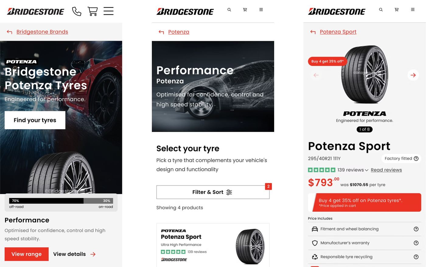
Mobile designs for Potenza tyre selection flow.
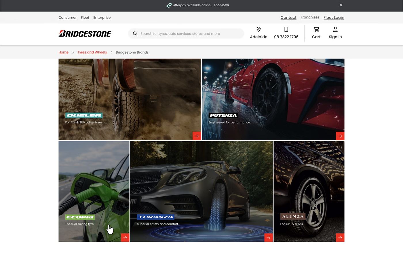
Desktop design for Bridgestone brands landing page.
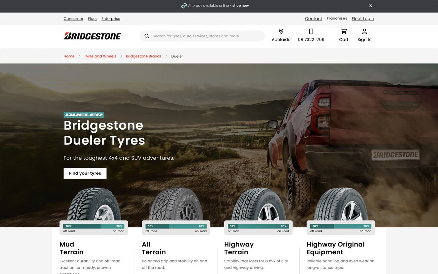
Desktop design for Dueler tyres landing page.
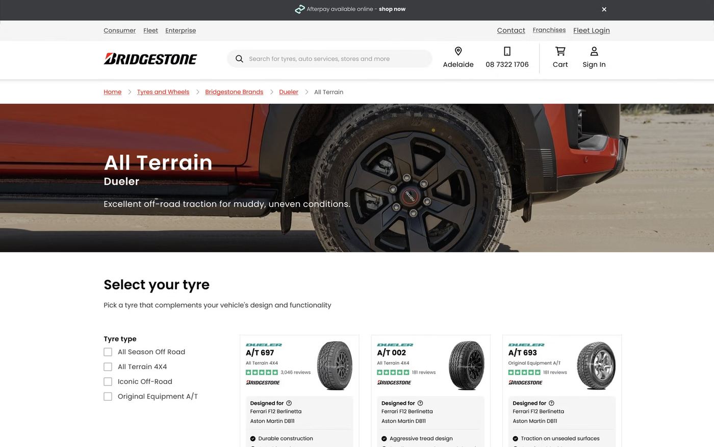
Desktop design for Dueler All Terrain tyre types.
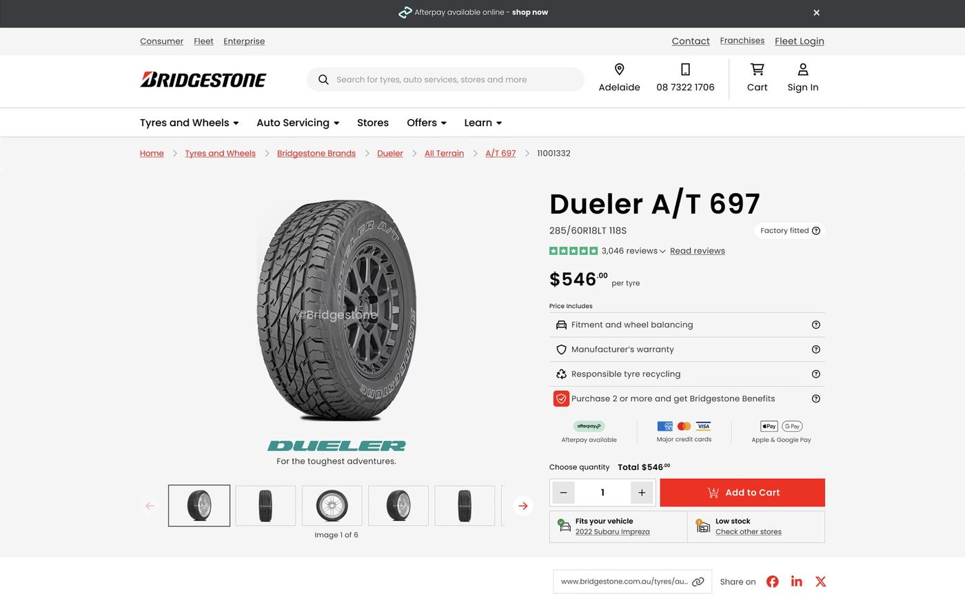
Desktop design for Dueler pattern page.
The pace and quality of output across the contract led to Bridgestone extending my original six-month engagement by two months, a direct reflection of the value the design work was delivering. Feedback from the UX manager and the extended Bridgestone team was consistently strong throughout, particularly around the volume of work produced and the quality maintained across it.
My work on the tyre selection flow contributed to addressing one of the platform's core conversion pain points, helping maintain the reduced number of steps between arriving on the site and reaching an add-to-cart action. The Uber x Bridgestone integration delivered a tailored, exclusive experience for Uber drivers, launched directly from within the Uber app.
The redesigned platform is scheduled to go live by the end of 2026.
Bridgestone was a different kind of engagement from the product design work that makes up most of my portfolio. It tested a different skill set, the ability to work efficiently within an established system, maintain quality at volume, and deliver consistently over an extended period without the creative latitude of a greenfield build. The contract extension was a meaningful validation of that, and it reinforced that design value isn't always about reinventing, sometimes it's about executing with rigour, pace, and consistency within constraints someone else defined.
Here are a few other projects to explore.


 Home
Home